
The best-preserved Frank Lloyd Wright house in Washington that you can actually visit sits quietly in Sammamish, just east of Seattle. Thanks to my alumni club, I recently toured the Brandes House: about 2,000 square feet on a 3.6-acre wooded lot, designed in 1952 and built for roughly $10,000. Wright's original drawings, still hanging inside, label the site "Bellevue, Washington," a reminder of how much the Eastside has changed around it.
The street facing facade of the Brandes House
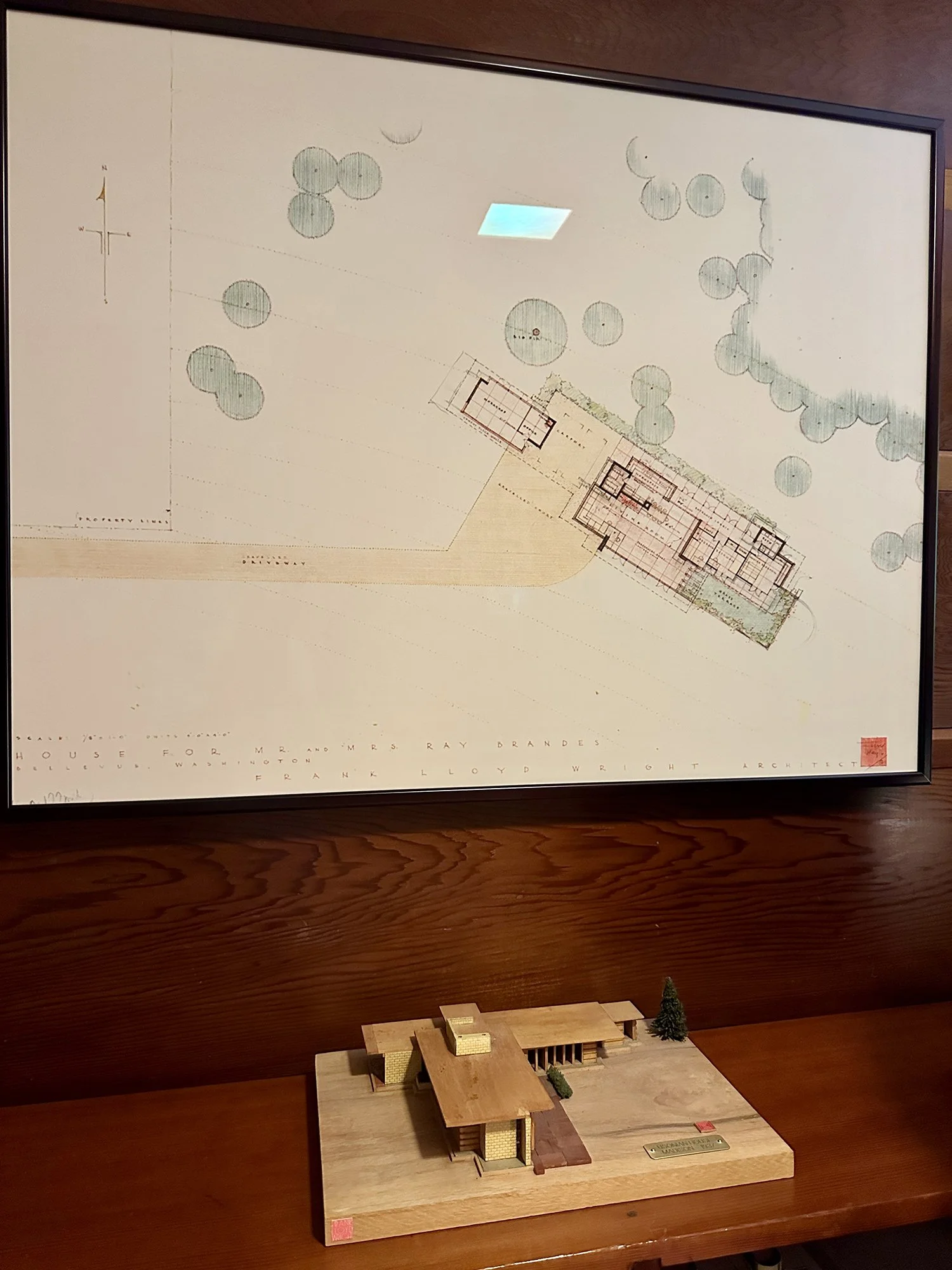
The drawing says “Bellevue” instead of “Sammamish”.
It is a Usonian house, Wright's answer to how a middle-class family could live in good architecture: modest in size, honest in materials, and tuned to its site. Seventy years later, this "budget" house still has more to teach residential designers than most new homes on the market.
Arrival: privacy and a carport
The entrance is not immediately visible upon arrival. Visitors discover it gradually, following the building toward a sheltered doorway. This creates a sense of anticipation while protecting the occupants’ privacy: an approaching guest does not immediately look into the home. It is a useful lesson in achieving privacy through planning.
The carport makes an equally thoughtful contribution. Open sides allow air, light, and views to pass through, giving the arrival space an openness that an enclosed garage rarely offers. Today’s garages frequently become storage rooms behind oversized doors. Here, parking occupies a sheltered outdoor space that feels like an integral part of the home.
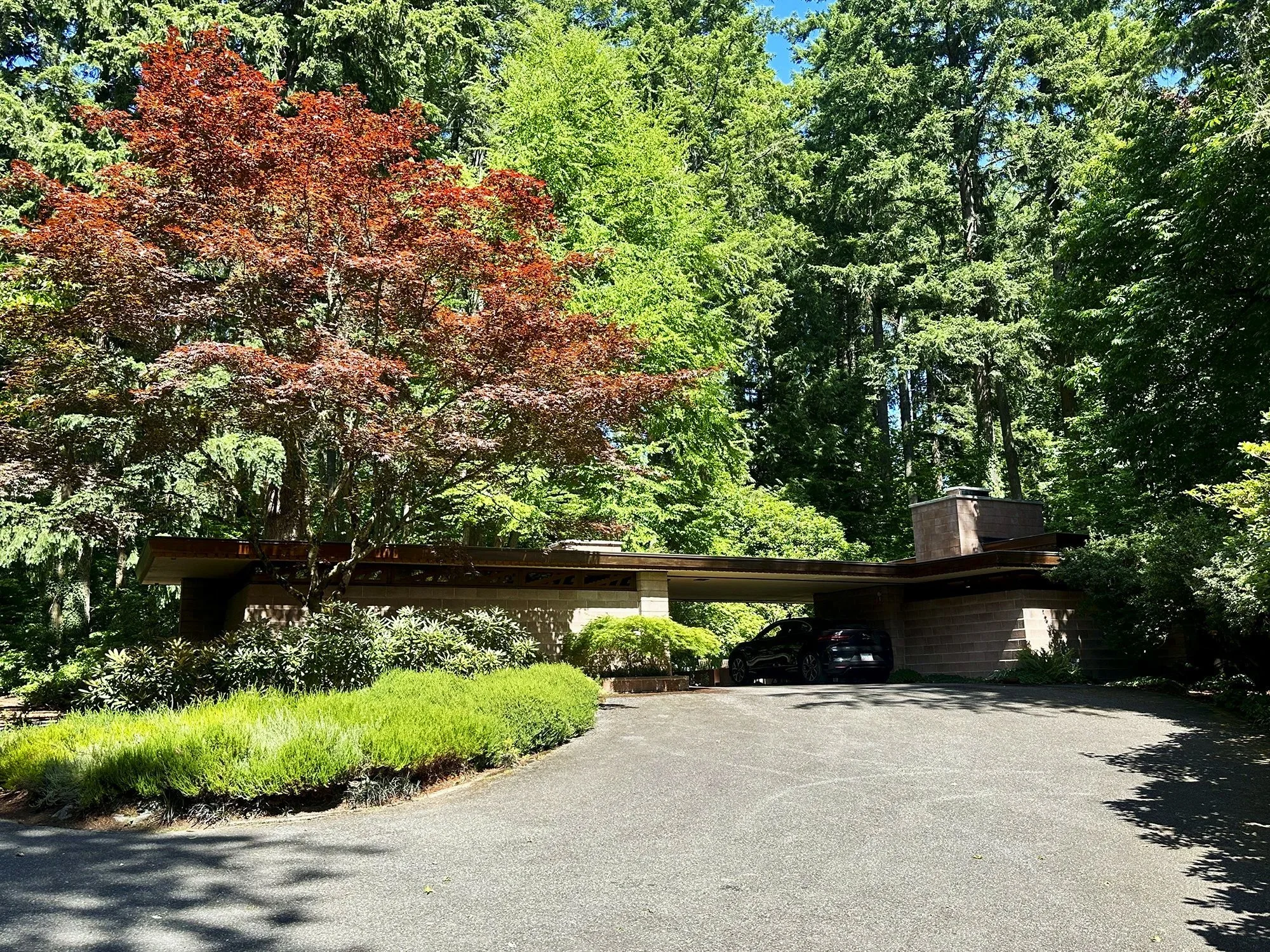
Arrival of the house
Effective material palette
The combination of concrete masonry units, wood, and stucco is particularly effective. CMU, commonly regarded as an economical construction material, provides texture, rhythm, and visual weight. Warm wood balances its roughness, while pale stucco surfaces reflect light. The horizontal boards and narrow battens demonstrate how careful proportion and craftsmanship can give a restrained palette considerable richness. Material cost alone does not determine architectural quality.
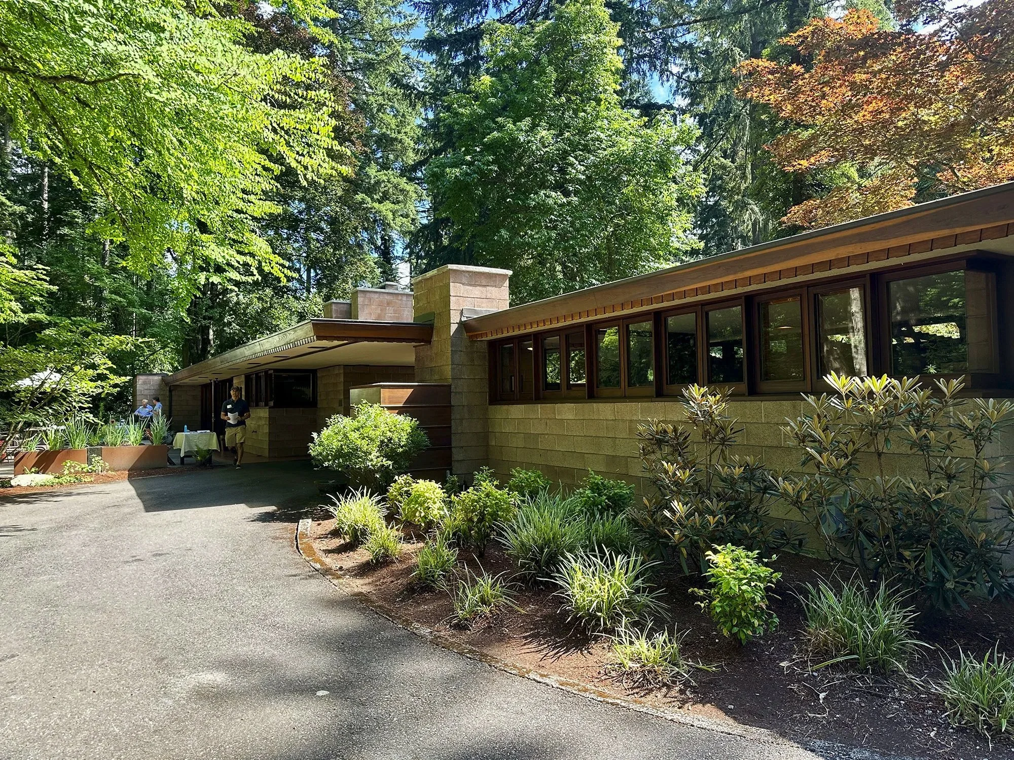
The use of CMU, wood, and stucco
Inside: light, space, built-ins, and soft corners
Inside, the treatment of light is remarkably varied. Glass-to-glass corners remove the visual interruption of a substantial corner post, allowing views to continue around the room. Narrow clerestory windows bring daylight into more enclosed areas while preserving wall space and privacy. Their geometric wood cutouts add a distinctive decorative layer, making an otherwise practical opening a memorable detail.
Changes in ceiling height also shape the interior experience. The seating area feels intimate and sheltered, while adjacent higher spaces provide a sense of release. The contrast demonstrates how spatial generosity can come from proportion and sequence, even within a modest footprint.
Wright’s attention extends to the scale of everyday life. Built-in seating, bookshelves, cabinetry, and bedroom ledges give each activity a considered place. One garden-facing desk now accommodates a laptop and office chair with surprising ease—a small reminder that well-designed spaces can adapt across generations. For contemporary homes, the lesson is to develop furniture arrangements and architecture together, anticipating how people will actually use a room.
One of the most compelling details is the glass-to-glass corner. Where two panes meet without a substantial corner post, the enclosure seems to dissolve, allowing the garden to wrap around the room.
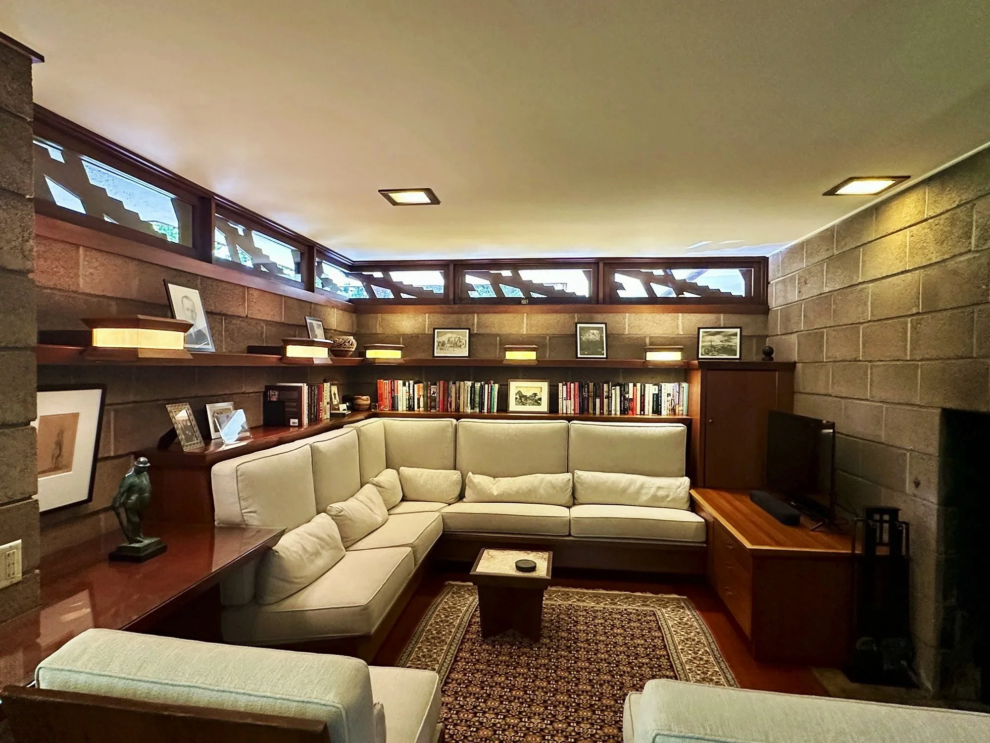
Living room are with clerestory windows and built-in seating and shelves
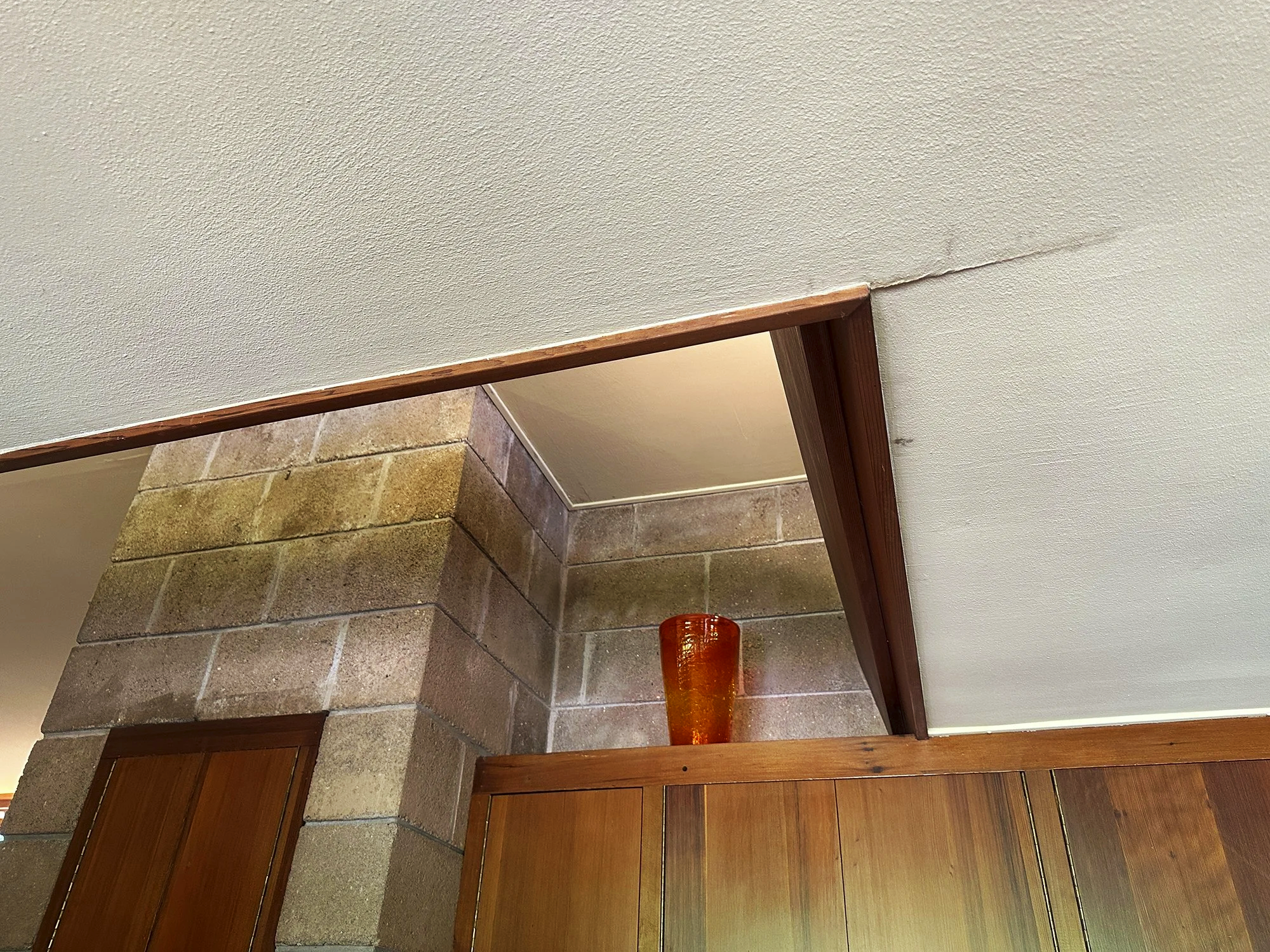
Shift in ceiling heights define zones and introduces spatial interests
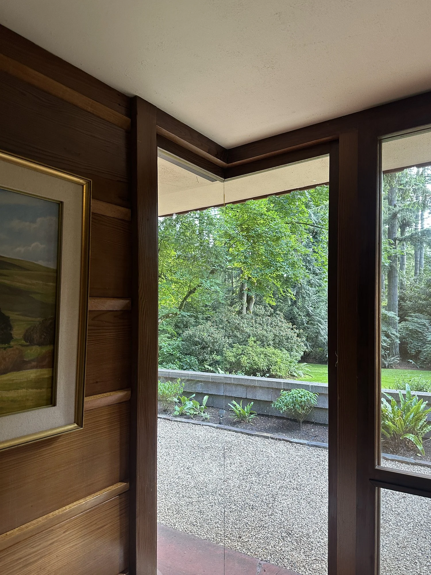
Most of the corners are “soft corners,” my favorite detail of the house.
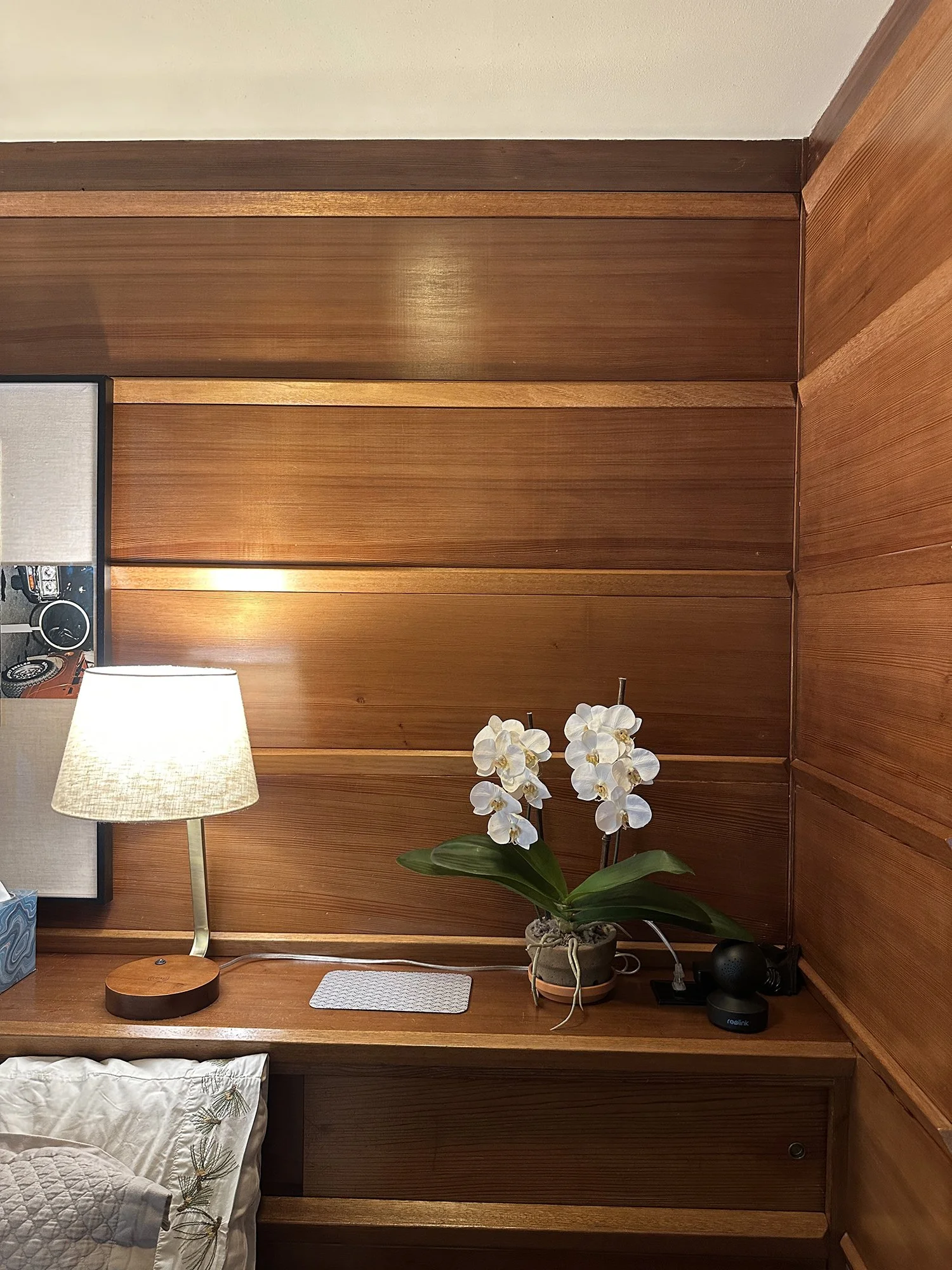
Board and batten in the bedroom adds to the intimacy and warmth of the space.
The overhang does the work
The deep roof overhangs combine environmental performance with a strong sense of shelter. They help protect walls and openings from winter rain and shade the glazing from summer sun, depending on orientation. Along the terrace, selective openings admit patches of sunlight, adding variation beneath the broad canopy. The owner also reported that the flat roof did not leak, with clearing fallen leaves forming part of its upkeep. Its performance challenges the assumption that flat roofs inevitably fail in our climate: appropriate slope, drainage, waterproofing, detailing, and maintenance all matter.
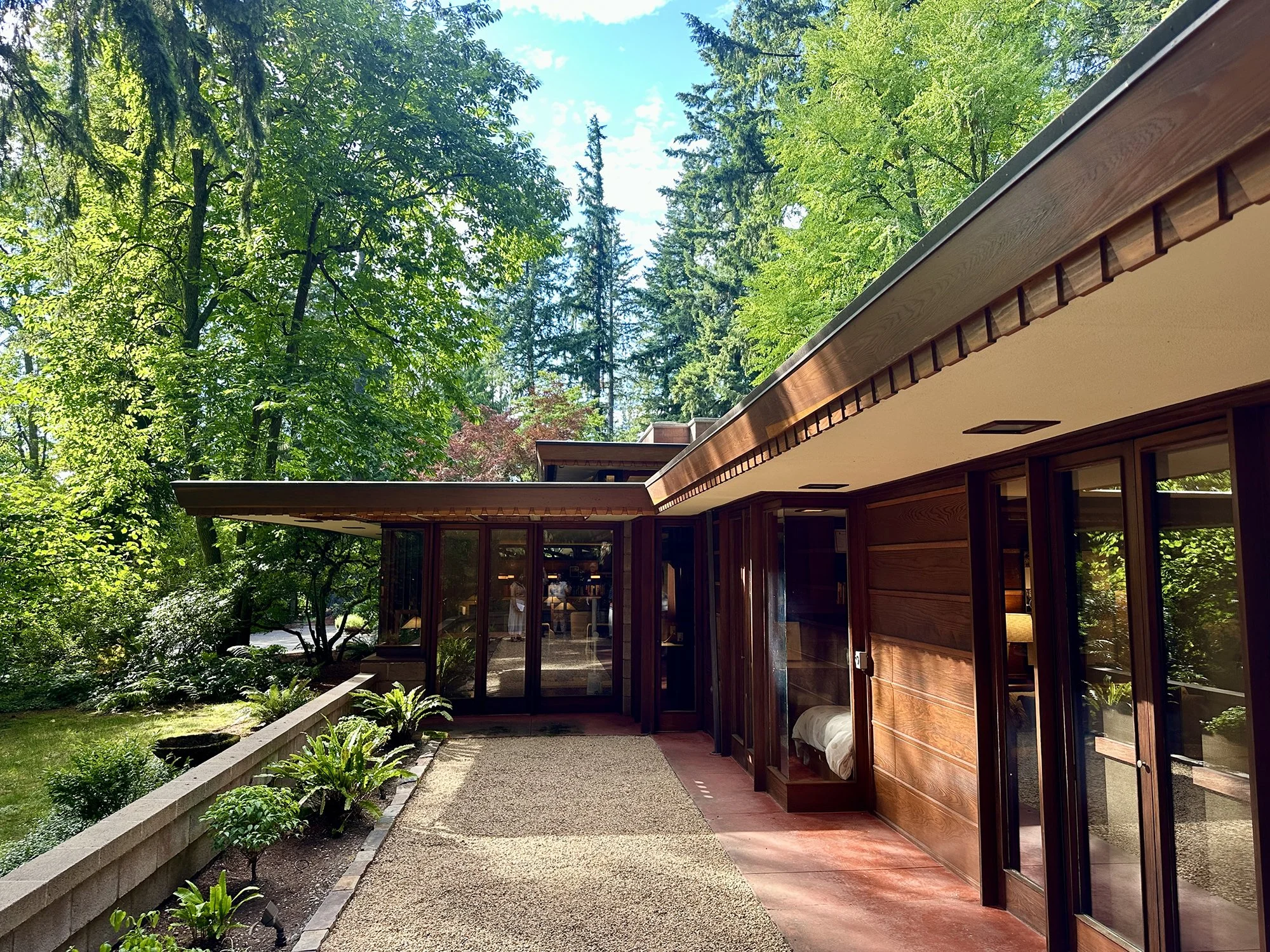
The projecting overhangs shelter the house from the elements.
A quiet statement
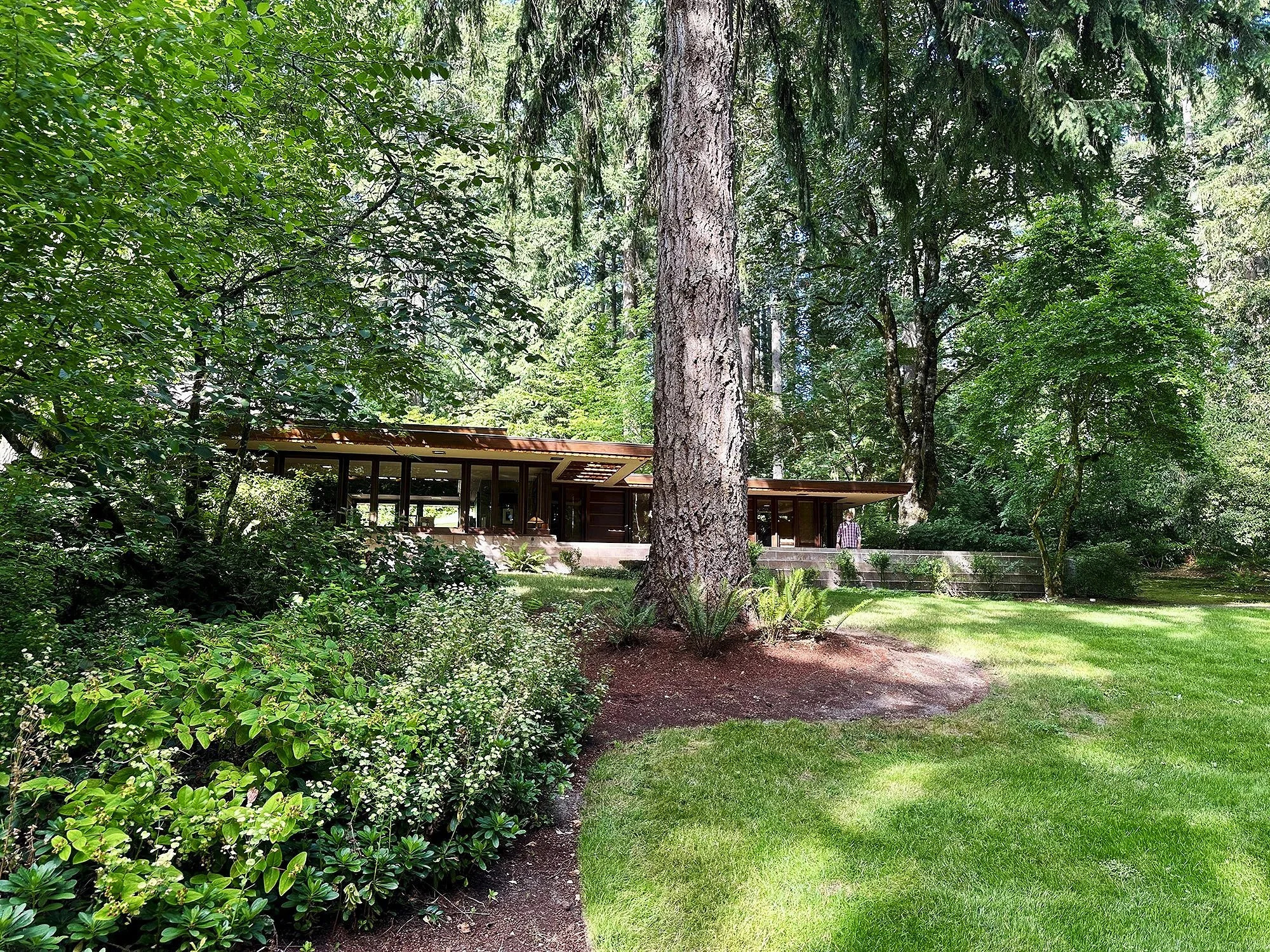
The framed site plan shows the house rotated diagonally on its lot, laid out on a grid, with the existing trees drawn carefully around it. On the garden side, it rests on a low block terrace wall beneath towering Douglas firs. From the lawn, the house nearly disappears into the canopy, with only the roof edge and the glass catching the light. Wright's own rendering shows exactly this: a thin horizontal line tucked among evergreens. It isn't overpowering. It's a subtle statement that lets the forest lead.
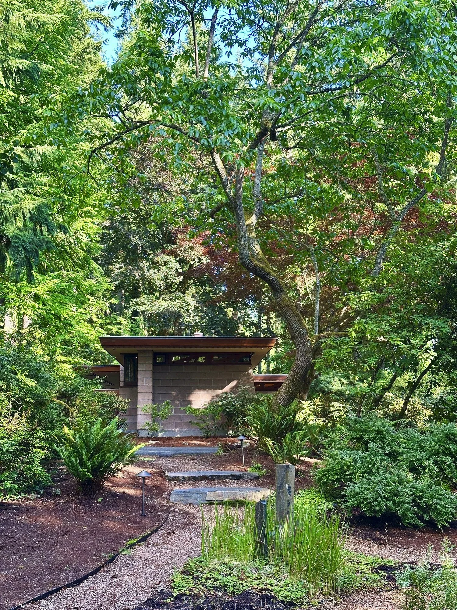
A building that fits into the landscape
Lessons for today
1. Design the arrival, not just the facade. A hidden entry gives privacy without walls or gates.
2. Question the garage. A carport can be lighter, cheaper, and more architectural.
3. Make affordable materials look intentional. Use few, use them consistently, detail the joints.
4. Let the roof do climate work. Deep overhangs handle our rain and summer sun.
5. Build it well. Execution matters more than roof shape.
6. Build the furniture into the house. Built-ins make small rooms feel complete.
7. Let the site lead. Rotate the plan, keep the trees, let the building step back.
I left with renewed appreciation for what thoughtful design can accomplish within a modest house. More than seven decades later, the Brandes House continues to set a compelling standard for residential architecture.