
Designing the façade — the exterior, the elevations, whatever you want to call it — is one of the most important parts of my work. For years I've wanted to put a few simple but important design principles down on paper for my clients, but I never found the time to organize the thoughts properly.
Then I came across a YouTube video by a Japanese architect who summarized these exact principles, more elegantly than I could have. I agree with him completely, so I translated his video and edited it into the short article below. Credit to the original architect is at the end.
Why a Home's Exterior Looks "Cheap" (And It's Not About the Price of the Materials)
Most people assume that a high-end exterior comes from expensive materials — that splurging on luxury tile or high-grade siding will automatically make a house look premium.
In practice, it's often the opposite. You've probably seen a house clad in expensive materials that still somehow looks cheap and characterless, right next to a modest home in ordinary materials that reads as calm, refined, and timeless.
The difference isn't the price tag. Long before material quality enters the conversation, most homes already struggle visually because of their lines.
The Hidden Problem: Too Many Unnecessary Lines
Every transition between materials creates a line. Every change in color adds an edge. Every trim piece, reveal, or termination is another visual interruption.
Pile enough of these up, and a house stops reading as a composition of clean architectural forms. Instead, it starts to look like a collage of finishes glued onto a surface — busy, fragmented, and strangely inexpensive, no matter how costly the materials actually were.
Which leads to a principle that now guides nearly every exterior I design:
Don't divide a wall. Divide a volume.
Or put even more simply:
Don't cut by surface — cut by box.
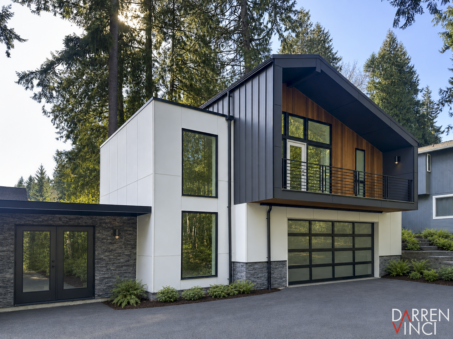
An addition in Bellevue that I designed from 2022 to 2023. The projecting volume clad in standing-seam metal sidings is the focus point of the design, while every other material works as a backdrop.
Think in Volumes, Not Surfaces
When you change materials, don't stop halfway across a wall. Wrap the material around the corner instead, and let it define an entire architectural volume.
When one material belongs to one complete box, and another material belongs to another box, every transition has a reason behind it. The architecture immediately feels cleaner, stronger, more intentional.
So many houses suffer from material changes that begin and end arbitrarily in the middle of a façade — transitions that have nothing to do with the building's actual geometry. The result looks arbitrary rather than designed.
Architecture should never feel decorated. It should feel composed.
Three Common Misconceptions
Before getting into design principles, it's worth clearing up three things people tend to get wrong.
1. Expensive materials look more luxurious. This is probably the most common misunderstanding of all. Premium tile, natural stone, exotic cladding — none of it will rescue a poorly composed façade. Meanwhile, even standard fiber-cement siding can look sophisticated when it's used with restraint and organized thoughtfully. Luxury comes from composition, not price.
2. More materials create more interest. Plenty of custom homes pile brick, stone, wood, metal panels, stucco, and half a dozen siding profiles onto a single elevation. Ironically, the most elegant homes tend to use the fewest materials. Every additional finish means more joints, more trim, more visual noise. Simplicity is what creates cohesion.
3. A custom home should showcase every favorite color. Personal taste matters, but exterior colors should respond to the site before they respond to the owner's preferences. A color that feels completely natural in one climate can look entirely out of place in another. Architecture outlasts trends — choose colors that belong to the environment, not just to you.
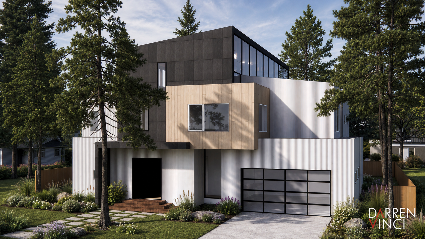
A new construction I designed in Bellevue in 2024. Again, the dark gray cement panels, the vertical cement siding and the wood exterior walls are defined by distinctive volumes.
Five Principles for Exterior Design
1. Limit yourself to two or three materials. More materials almost never improve a design — they weaken it. A successful exterior usually rests on just two primary materials: smooth stucco with standing-seam metal, fiber-cement panels with natural wood, or stucco with cedar siding, for example. Restraint is what lets each material stand on its own.
2. Change materials by volume, not by surface. This is the most important principle of all. Material changes should happen at outside or inside corners — never in the middle of a wall. Treat the building as a composition of boxes, and let each box have its own identity. When materials wrap entire volumes instead of stopping mid-wall, the architecture gains real clarity and strength.
Even soffits can reinforce this idea. Rather than painting every soffit white by default, consider continuing the wall or roof material underneath instead. It strengthens the geometry and removes one more unnecessary interruption.
3. Don't imitate other materials. Avoid anything designed to look like something it isn't. Tile-look siding will never be tile. Wood-look fiber cement will never truly read as wood. They might fool you from a distance, but up close, the joints, texture, and reflected light always give it away.
If the budget doesn't stretch to real wood or real tile, don't try to fake it — use honest materials honestly. Fiber cement should look like fiber cement. Stucco should look like stucco. Authenticity ages far better than imitation ever will.
4. Establish a clear hierarchy. Every exterior needs a primary material and a supporting one. A rough rule of thumb is an 80/20 split, or at most 70/30. When two materials compete on equal footing, neither one wins, and the composition feels unresolved. When one material clearly leads and the other plays a supporting role, the whole thing feels calm and intentional.
5. Design for the local light. Color should respond to geography — architecture doesn't exist in a vacuum, it exists within a landscape. The vivid pinks and yellows of Luis Barragán's work in Mexico succeed because they belong to Mexico's intense sunlight and atmosphere. The lesson isn't to copy his palette; it's to understand why those colors work there.
In much of Japan and the Pacific Northwest, the landscape leans toward muted earth tones, soft gray skies, and diffused light — lower-saturation colors simply feel more at home in that environment. Good color selection starts with understanding the site, not with personal preference.
Design the Form Before the Finish
One mistake I see again and again is treating exterior materials as the final decorative step. The usual sequence goes something like this: design the floor plan, develop the elevations, then choose the siding at the very end. By that point, it's often too late.
Material transitions aren't decoration — they define architectural form. When I start a project, I study massing with simple white models first. Stripped of color and texture, the form becomes much easier to judge honestly. If a building works as a white model, it usually doesn't need extra materials to create interest. And if it doesn't work, piling on more finishes rarely fixes the problem — it usually just adds more lines.
When Breaking the Rules Makes Sense
Like any design principle, there are exceptions. Sometimes a material transition happens for a clear architectural reason. I might finish exterior courtyard walls in the same white plaster used inside the home, while wrapping the public-facing side of the house in dark metal cladding. The transition still happens at a corner, never randomly mid-wall, but here it reinforces the larger idea: moving from a public exterior into a protected interior world.
When there's a clear architectural idea behind it, an exception becomes meaningful instead of arbitrary.
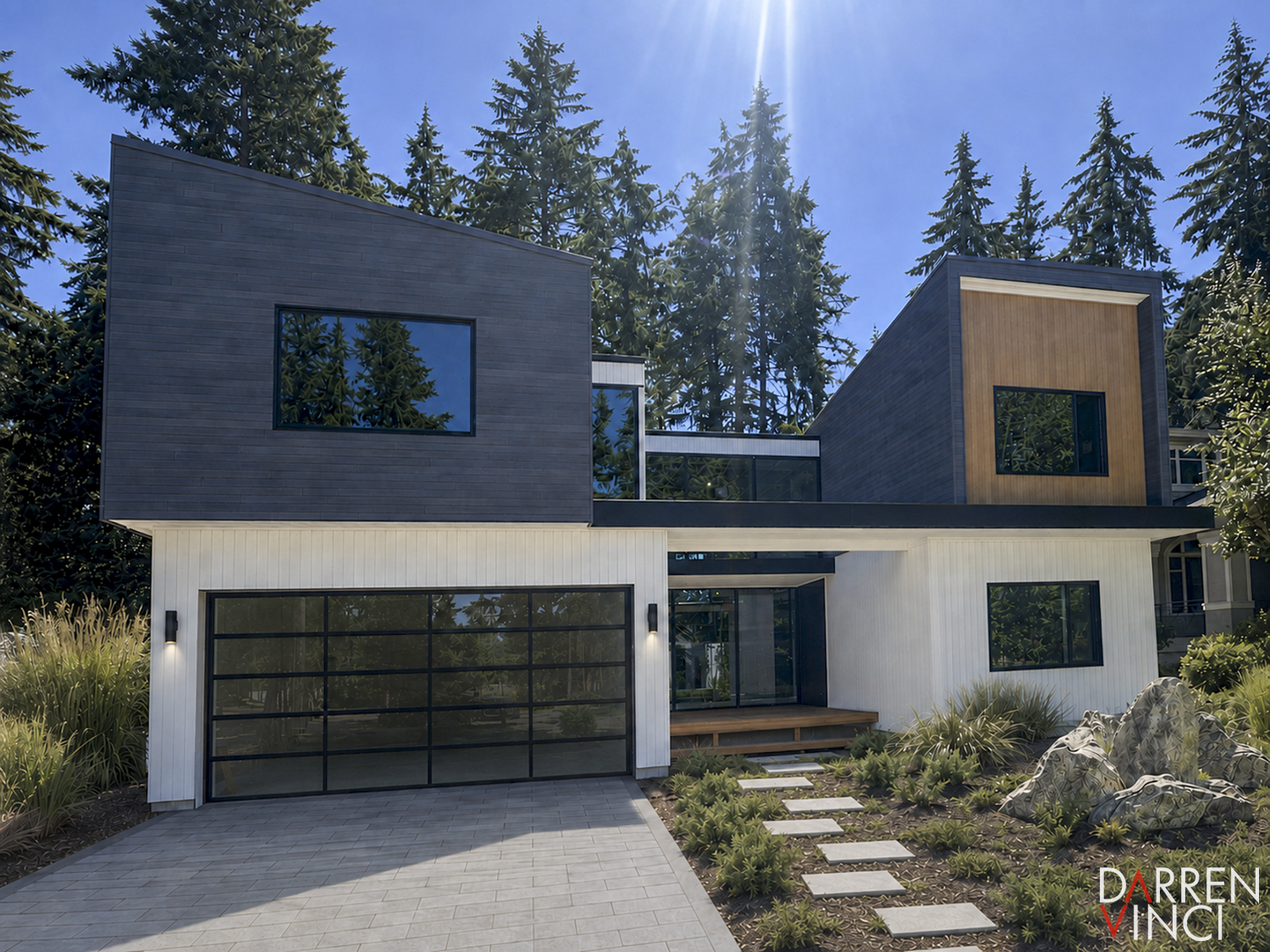
Another project of mine in Bellevue is under construction, showcasing the same exterior facade design philosophy.
Final Thoughts
The biggest reason so many homes look inexpensive has nothing to do with cheap materials. It's because the lines aren't disciplined.
Good exterior design isn't primarily about choosing premium products — it's about organizing form:
Keep the number of materials limited.
Let each material define a complete volume.
Use honest materials honestly.
Establish a clear hierarchy.
Choose colors that belong to the place.
Most importantly: don't cut by surface — cut by box.
Once you start seeing architecture this way, you'll notice that the most refined homes often rely on surprisingly ordinary materials. Their elegance doesn't come from what they're made of — it comes from how they're composed.
Credit: Simple Residential Design 高級に見える外壁 vs 安っぽく見える外壁【外壁の5つの鉄則】